Photography

17 posts

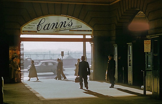
Fred Mitchell’s Shots of 1950s and 1960s Melbourne

I just discovered that my great uncle, Fred Mitchell, is selling his photos as prints on RedBubble. Fred’s photos have been a source of admiration in my family for years, but it’s nice to see them readily available somewhere that a wider audience can view and order them.

While his collection is very wide and full of good stuff, it’s his photos of mid-twentieth century Melbourne that I keep going back to: in addition to their intrinsic attractiveness, they are fascinating for their portrait of daily life in 1950s Melbourne. (One of his products is a calendar collecting together many of the best).

Continue reading

The Visual Aesthetic We Deserve?

Lygon Street

The purchase of Instagram by Facebook the other week interested me, if only because I have been noodling around with the service myself in recent weeks. This fits my long-standing pattern of being just enough of an early adopter to leap on board something at the exact moment it becomes passé. At one level I can understand the incredulity about the price (a billion dollars is a lot to pay for a service thats only revenue plan seems to be “get purchased by facebook”) and about the merits of Instagram itself (Jon Stewart epitomised a widespread perspective when he described it as a “thing that kind of ruins your picture.”)

While its value to Facebook may seem dubious, I can see the merit of Instagram itself from a user’s perspective. It is true that at one level those filters are, at worst, ruining your picture as Jon Stewart says and, at best, just adding a cheap veneer of artiness. No doubt people will sneer at the Instagram aesthetic, driven as it is by gimmicks like the graininess, ersatz tilt shift, and old-timey colour filters in the image at the head of this article. Yet while the Instagram effects are in a sense cheap tricks, they are also doing something real, which is stripping the naturalism from the photo and making us see it with fresh eyes. I like that something so popular is making people look differently at their images, and stirring the realisation that even that naturalistic look from a good camera is not a neutral aesthetic choice.

Continue reading

Deserted Disney World

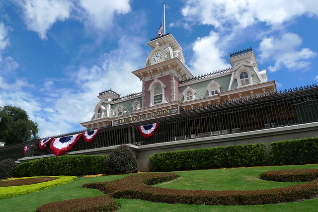
As a companion to my photos of deserted Disneyland, here’s a selection of shots of the Magic Kingdom at Disney World. Once again, for a sense of why this might be interesting, I suggest you look at my post about Disneyland as an example of urban design.

As I suggest in that article, I don’t think the design of the Magic Kingdom is nearly as successful as the original Disneyland, although this is hard to fully convey in a series of photos. The architecture is grander and more show-offy, and hence more vulgar and less charming.

P1060071
Continue reading

Deserted Disneyland

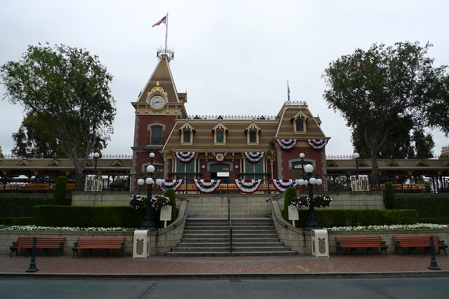
A look at the architecture of Disneyland, uncluttered by visitors. Who says you can’t get away from the crowds?

If you’re perplexed as to why this would be of interest to anybody, I talk more about Disneyland at this post. You can see a similar set of shots for the Magic Kingdom at Disney World here, allowing you to compare the architecture of the two parks.

Continue reading