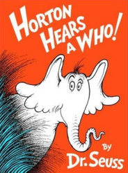
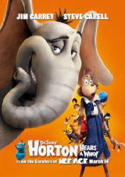
Horton Hears a Who! (Jimmy Hayward & Steve Martino, 2008)
We’ve entered the second decade of computer-animated movies (Toy Story having come out way back in 1995), and we are now starting to see the really interesting things that can be done visually with the medium. When I wrote about Ratatouille, I remarked upon the fantastic look it had, which seemed to me a leap ahead of other such films I’d seen; now the new film from animation studio Blue Sky, Horton Hears a Who!, pushes the medium in a different way by adapting the distinctive visual look of Dr Seuss to computer animation. They do a good job: the film has some really exciting visual moments. Yet it’s hamstrung by the accumulated bad habits of a decade of these kinds of films.
The success of the Blue Sky studios’ visual translation of Seuss’ art isn’t apparent until a little way into the film. The opening sequences, set in the jungle and featuring the Jim Carrey voiced Horton, show only a light Seuss influence in the visuals and character design. Only the distinct Seussian rhyming in the narration (and the story itself) point to the Seuss source. However, once Horton hears the Who – a tiny being on a speck of dust that floats past Horton – and we enter the world of Whoville, the visuals pick up considerably. One of the opening shots of Whoville is a giddy flying shot over the town, and its great to see the world of Dr Seuss brought to life like this, complete with its rounded architecture and elaborate stairs and ramps. It’s a really good moment, and is at least a part pay-off of the admirable ambition of Blue Sky in adapting such classic material. For all the fuss about Pixar – whose work generally remains far superior to Blue Sky’s – they haven’t attempted to take on a source so well loved, or so distinctive.
The problem, though, is that within the relatively faithful adaptation of Seuss’ story, there is so much that cuts across his work. The film has been padded a great deal simply to expand it to feature length (the previous animated adaptation by Chuck Jones, made in 1970, was less than 30 minutes long), and there is also a great deal of embellishment with additional sight gags, verbal humour and pop-culture references. These are the by-now obligatory nods to the conventional wisdom that animated films must be ironic and media savvy like Aladdin and Shrek to make money (never mind that the ultra-successful Pixar films largely avoid such humour). There isn’t something intrinsically wrong with such jokes, but the problem here is that they are completely at odds with the spirit of the book. Seuss’ storytelling had a beautiful simplicity to it, and even his illustrations (despite being loaded with elaborate inventions) had a spareness to them, derived from the pen and ink media with which he worked. The jam-packed visual and verbal gags here simply add clutter and thus disrupt the tone. Probably the most serious example of this is the casting of Jim Carrey as Horton: his manic dialogue is all wrong for the character, who has been completely transformed to suit Carrey’s strengths. In the Dr Seuss books, Horton is a slow, deliberate, loyal and thoughtful character (after all, in his first book, Horton Hatches the Egg, his heroic act is simply to sit in one place for a long time). Here, however, he is fleet-footed and hyperactive, and his powers of imagination have gone from the philosophical and empathetic kind (Horton has the vision to see that a whole world exists on the speck) to that of an overstimulated child (who has fanciful visions of himself inside a pastiche of superhero anime).
The extent of pop-culture-reference humour brought me back to some of the thoughts about what we classify as kids entertainment that I had previously mused on after seeing the lacklustre Bee Movie. I often see such pop-culture jokes described as having been put in “for the adults;” they’re something, apparently, that will tide adults over as they sit through a film they brought the kids to. But who are these adults for whom sitting through Horton Hears a Who! will be made more palatable by the fact that a line from Apocalypse Now is reworked to refer to bananas rather than napalm? I would have hoped that adults might be more likely to respond to the qualities of Seuss’ book: the beautiful purity of its visual style; its sense of aesthetic harmony between message and imagery; its touching moral; and the endearing loyalty and patience of its protagonist. Yet those are the things the film sacrifices in order to shoe-horn Jim Carrey’s humour into Seuss’ world.
In fairness, it should be noted that the best animators in the world have struggled to do justice to Seuss: Bob Clampett adapted Horton Hatches the Egg as a Warner Bros cartoon in 1942 (yes, the book is that old), while as mentioned Chuck Jones did a version of Hears a Who! for TV. Clampett and Jones both knew Seuss, and Seuss directly collaborated with Jones on his adaptation. Even with such talent involved, both those adaptations are only so-so as entertainment; but they are considerably more sympathetic to Seuss than this new version.
Seuss was a great author and illustrator, and I love the idea that his art could inspire computer animators to push in some new directions. What would be more exciting, however, would be if there were some wider lessons learnt from Seuss than just the visual.

