Who Framed Roger Rabbit? (Robert Zemeckis, 1988)
When people talk of the revival of animation in the 1990s, they tend to date the start of the resurgence from Disney’s 1989 feature The Little Mermaid. Certainly there is more continuity in personnel between The Little Mermaid and the 90s hits (such as Aladdin, Beauty and the Beast, and The Lion King) than there is with Who Framed Roger Rabbit. Yet I would argue that the strength of the 90s boom came from the fact that it crossed over into adult audiences: this is clearer when one looks past just the Disney films and considers the full array of animation that sprang out of this period, which includes not only the wave of excellent computer animation (Toy Story, Antz, Monsters Inc, Shrek) but also television work (“The Simpsons,” “Futurama,” “South Park,” and many others). The fact that adults were prepared to go along to these films, or watch these shows, contributed significantly to their success. Adults did so largely because appreciation of the Hollywood tradition of classical animation had bubbled through to the mainstream. People who grew up with the cartoons of the “Golden Age” of the 1930s to 1950s (a staple on TV from the 1960s onwards) were now adults who appreciated the quality of what they had seen. Who Framed Roger Rabbit, Robert Zemeckis’ elaborate tribute to Hollywood cartoons, served as a marker for this nostalgia, and hinted at the widening of the audience for animation that occurred in the 90s. Yet it still provokes mixed feelings amongst animation fans.
The film is an adaptation of Gary Wolf’s otherwise obscure comic novel Who Censored Roger Rabbit? Wolf’s novel is a satire of detective fiction very much written for adults. Like the film, it features a race of beings called toons, although in Wolf’s book they are actually strip cartoon characters. While consistently amusing, it’s gritty and downbeat: Roger Rabbit is murdered early on, for example, and the analogy between toons and real-life minority groups is more explicit. In adapting it, screenwriters Jeffrey Price and Peter Seaman managed to keep many of its strengths, and a few key characters, but made wholesale changes. Toons, for obvious reasons, were re-envisioned as stars of animated films, bringing in the link to Hollywood animation. While the original’s evocation of pulp detective fiction could easily be transferred to the film equivalent (film noir), Wolf’s complicated plot itself is jettisoned. Price and Seaman instead opt for a simpler story that alludes, Chinatown-style, to the real history of urban planning in L.A. (in particular, the demolition of the city’s public transport system by automobile-related business interests). It’s a brilliant basis for a movie, making the most of the fortuitous fact that the Golden Ages of Hollywood cartoons and noir almost exactly coincide: by choosing 1947 Hollywood as their setting, the screenwriters have placed their characters at the centre of both traditions.
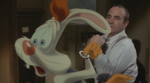
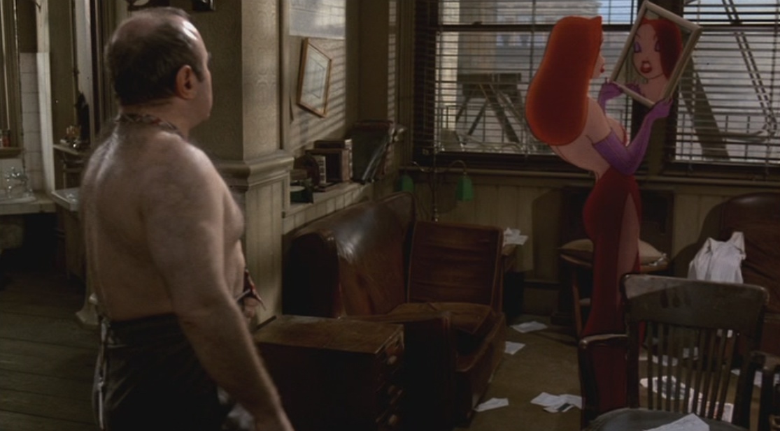
Zemeckis goes a long way to delivering on the potential of this premise. The film is fast moving, funny, and full of good performances. Bob Hoskins, in particular, manages to make his detective Eddie Valiant an appealing central character while overcoming some imposing technical challenges: he shares the majority of his scenes with animated characters added in post-production, and maintains a flawless American accent while doing so. Yet it’s the animated characters upon which the film really rides. Richard Williams directed the animation, and his realisation of the animated characters is astounding, particularly given that character animation was at a low ebb at the time. While the central character of Roger Rabbit is often – rightly – criticised for being grating, this is a fault of the script, and William’s animation in fact helps to take the rough edges off. The other major original characters are easier to take and superbly done: both Baby Herman and Jessica Rabbit are lifted from Wolf’s book, but Williams has also drawn inspiration from classic cartoons (notably Chuck Jones’s 1954 short Baby Buggy Bunny for Herman, and Tex Avery’s Wolf series for Jessica). Perhaps the ultimate tribute to the effectiveness of these characters is that they co-exist seamlessly besides human characters. This is an achievement even when the human performances are as broad as they are here, since animation can rarely approach the naturalism of even a merely capable live-action performance.
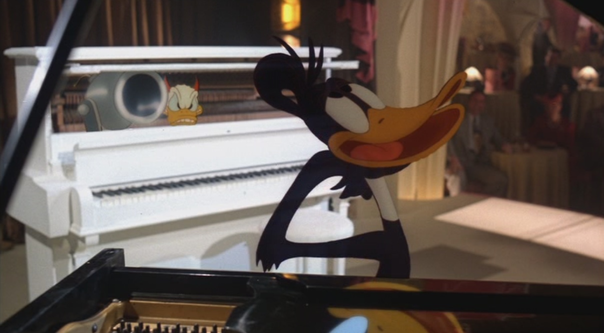
The film’s chief delight, however, is its use of classic animated characters. Steven Spielberg’s influence was apparently decisive in securing the use of cartoon stars from all the major cartoon studios (Disney, Warner, Fleischer and MGM), and the list of characters who appear includes Mickey Mouse, Bugs Bunny, Donald Duck, Daffy Duck, Tweety, Betty Boop, and Droopy. In a nice touch, all appear as they were in 1947: so Tweety is somewhere between the Bob Clampett and Friz Freleng versions of the character, and Daffy is much closer to a Clampett era Daffy than the more familiar 1950s Chuck Jones version. The animation of these cameos is as in-character as any post 1960s work with these characters that I’ve seen, and their presence lifts the film immensely. By far the best scene in the movie, for example, is the all-too-brief on-screen combination of Daffy and Donald Duck, performing a piano duet of Liszt’s second Hungarian Rhapsody. There’s a delirious thrill that comes from seeing these characters walk around in the “real world,” particularly when it has been achieved so flawlessly. Like Hoskins, Williams was working within enormous technical obstacles on this project, and the hybrid of live-action and animation is impeccably done. A lot of fiendishly difficult details are included as throwaways, such as the fact that the animated Baby Herman carries a real cigar.
So what’s the problem? The film has been criticised by notable figures from both the animation industry and its scholarship. Chuck Jones, for example, called the film “terrible,” suggesting it made a poor attempt to duplicate Tex Avery’s style. Michael Barrier, who wrote the landmark work on Golden Age animation, Hollywood Cartoons: American Animation in it’s Golden Age, has referred on his website to Richard Williams’ animation as “disastrous.” Williams himself records the reaction of veteran Disney animator Frank Thomas in his book, The Animator’s Survival Kit:
Animation was kind of in the doldrums when we started making Who Framed Roger Rabbit and Frank wrote me a wonderfully encouraging letter including, “if you bring this off, you’ll be a hero.” …When the picture came out and was a hit, nothing from Frank. 2 months later it’s the biggest picture of the year, nothing from Frank. 3 months later I rang him up.
“Hi, Frank, it’s Dick”
“…Yeah…”
“Hi, Frank, well, we made it! It’s a hit, Frank! It’s a hit!”
“…Yeah…”
“I mean, well, we did the best we could and it’s a huge success! Enormous!”
“…Yeah.”
“Well, I know, Frank, it could have been better, but we really worked hard and everybody loves it!”
“… Yeah.”
“Well, er, um, I guess that you could say that we raised a gimmick to the level of a novelty, but it’s a hit!”
“… Yeah.”“Aw, come on Frank, I know you always criticise me for not grabbing the audience emotionally – but you’ve got to give it to me, when the villain’s going to kill the rabbit by dipping him in the vat of acetone, all the kids in the audience yell, ‘Don’t do it! Don’t do it!’”
(Long Pause) “… I wish they had.”
From Richard Williams, The Animator’s Survival Kit, Faber & Faber, p. 318.
Thomas’ observation, and the reservations of Jones and Barrier, goes deeper than simply the fact that Roger can be irritating, as Williams is acknowledging by highlighting the question of emotional involvement in the above quote. The problem has to do with the style of animation used and the way the characters act. I suspect that in this regard the film lost a lot of support amongst animators in its opening short, in which Roger Rabbit destroys most of a kitchen while trying to save Baby Herman. It’s hilarious, simply because it’s so intricately thought out, but the extremity of it is off-putting: if it resembles the work of any classical directors, it’s the teaming of Bill Hannah and Joseph Barbera, who directed the Tom and Jerry shorts at MGM in the 1940s and 1950s. These shorts are not as enduring as equivalent chase series such as Jones’ Road Runner series or even Friz Freleng’s Tweety cartoons, chiefly because of the limited characterisation. They are purely gags, with virtually no attempt to establish any personality in the protagonists. The opening Roger Rabbit short fits into this pattern, and the main body of the film only partially shrugs this problem off.
As I have suggested, I believe this is a script problem, not strictly an animation problem. In Wolf’s novel, Roger had a hidden agenda, and this added depth and even poignancy to his plight. The film greatly simplifies Roger’s character, leaving his eagerness to please as his defining personality trait: this leaves little room for audience sympathy. The result is that at an emotional level, the film is hollow at the core. Ironically, the script makes a feature of the tension between Valiant’s no-nonsense attitude and Roger’s desire for a laugh at any cost. At the conclusion, Valiant learns that he needs to lighten up and embrace the fun-loving cartooniness that Roger supposedly embodies. This thematic thread suggests the balance between undisciplined craziness and character integrity that is central to the best classical animation by Clampett, Avery, or Jones. These veteran directors understood that to create characters with lasting appeal there needed to be some recognisably human traits to the characters. By suggesting that “anything for a laugh” Roger (who shows only the briefest moment of empathy for Valiant) is right and the grief-stricken Valiant is somehow wrong to feel the way he does, the film articulates its central imbalance: it’s not nearly as interested in making Roger real as it is in making him funny. This, I think, is the underlying absence that Jones, Barrier and Thomas all felt.
There’s also something off about Zemeckis’ whole approach to the film. It should be evocative of film noir, yet Zemeckis’ regular collaborator Dean Cundey has photographed it in bright, friendly, artificial colours. The production design exacerbates the problem, with everything looking too conspicuously set-bound. When Valiant goes to a supposedly down-at-heel bar, or to his unkempt office, it is a meticulously designed untidiness that confronts him. The sense of unreality is all pervasive, and detrimental to the film. (Much of Zemeckis’ work has the same problem, notably the Back to the Future sequels, made soon after). This look recalls the clean lines and bright colours of animation, but the film would be much more satisfying if the animated characters could venture into a world that showed more contrast with their own. There needed to be some darkness, some palpable reality in the film, for the full promise of the idea to be realised.

