I am talking tonight at Loop, and this post should appear by the magic of WordPress as I’m speaking. I thought it may be worth providing links to a few of the pieces of writing that explore things I touch on in my presentation.

I am talking tonight at Loop, and this post should appear by the magic of WordPress as I’m speaking. I thought it may be worth providing links to a few of the pieces of writing that explore things I touch on in my presentation.
In my recent post about Walt Disney’s knack for urban design, I alluded to the comparative disappointment of Disney World, the Florida Disney park brought to completion without Walt Disney’s involvement (the park opened in 1971, while Walt Disney had died in 1966). Yet I didn’t really get into the full scale of that disappointment. Disney World, as Walt Disney envisaged it, was intended to be a far grander and more ambitious project than it ultimately became. Rather than a network of theme parks and resorts, the Florida property was envisaged as a giant complex featuring not just a theme park and resorts but also an airport, industrial park and – most interestingly – a planned city known as EPCOT (for Experimental Prototype Community of Tomorrow).
The city wasn’t an afterthought: it was actually the most important element of the project in Disney’s mind. In a film prepared in 1966 to brief Florida legislature on the project, Disney emphasised EPCOT’s importance:
I don’t believe there’s a challenge anywhere in the world that’s more important to people everywhere than finding solutions to the problems of our cities. But where do we begin? How do we start answering this great challenge? Well, we’re convinced we must start with the public need. And the need is not just for curing the old ills of old cities. We think the need is for starting from scratch on virgin land and building a special type of new community.
This interest in urban planning did not come from nowhere: Disney’s interest had been growing for some time. From the late 1940s onwards, as his interest in animation waned, Disney’s principal creative output had become his contribution to the physical environment. Disneyland was, of course, the most obvious example, but this interest manifested itself in numerous sphere of his life. At a small scale, in his domestic sphere, he became immersed in the construction of elaborate model railways in his home. He had also turned his mind to the effect of the physical environment on creative endeavour when he planned his new studio in Burbank in the late 1930s and then, later, through his involvement in the planning of a campus for the newly-formed California Institute of the Arts in the early 1960s. He dabbled in property development with the proposed (but never built) Mineral Kings ski resort in Southern California, and with an urban renewal project in his plans to redevelop a two block area of riverfront in St. Louis. In the immediate aftermath of the Disneyland project, he spun off the work on its attractions and people movement systems into design work on several World’s Fairs, as well as monorail and “People Mover” designs of potentially wider application.
As a companion to my photos of deserted Disneyland, here’s a selection of shots of the Magic Kingdom at Disney World. Once again, for a sense of why this might be interesting, I suggest you look at my post about Disneyland as an example of urban design.
As I suggest in that article, I don’t think the design of the Magic Kingdom is nearly as successful as the original Disneyland, although this is hard to fully convey in a series of photos. The architecture is grander and more show-offy, and hence more vulgar and less charming.
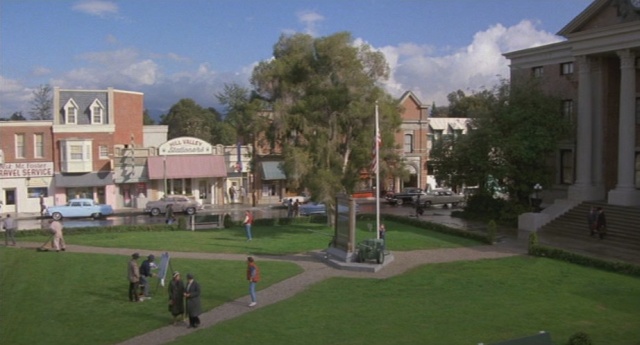
I wrote the other day about Courthouse Square, the ubiquitous town centre used in countless films and TV shows. For someone like me, interested in both films and cities, a place like this is fascinating as a built embodiment of the kind of community that films and television shows hold up as an ideal. In reality, most of us live in far more mundane suburban environments that suffer various shortcomings: they are too dispersed, with residential, retail, and employment activities frequently located far apart; they have too little public transport, making us too dependent on cars; they are short of true public space, substituting instead private spaces such as shopping malls; and so on. Yet in films and television shows places like Courthouse Square are held forth as an alluring image of the town that has a discernible centre, public space, civic facilities, and an old-fashioned charm. These sets are interesting to an urban planner such as myself because they represent the best efforts of highly experienced dream manufacturers to build the ideal community.
What’s even more interesting, though, is the example of Disneyland. Essentially, what we have here is a filmmaker, Walt Disney, who after World War II became increasingly disinterested in making films and turned instead to place making. He purchased land on the fringe of the city that epitomises the post-war urban fabric, built an environment strikingly similar to one of these movie towns, and then charged admission to it. The front section of Disneyland, and the one section that every visitor must pass through, is Main Street USA, a tangible realisation of the Hollywood movie town (my essay here gives extensive detail on the traits of the classic Hollywood town). Disney, renowned for his escapist film fantasies, was here selling people an escape to the fantasy of a pleasant, pedestrian-friendly urban environment with a civic square and public transport. In postwar L.A. this was a commodity in such short supply that Disney was able to turn around the fortunes of his struggling business driven almost solely by his Disneyland profits.
A look at the architecture of Disneyland, uncluttered by visitors. Who says you can’t get away from the crowds?
If you’re perplexed as to why this would be of interest to anybody, I talk more about Disneyland at this post. You can see a similar set of shots for the Magic Kingdom at Disney World here, allowing you to compare the architecture of the two parks.
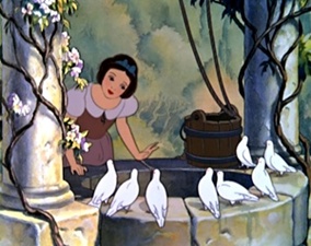
Dreams Come True (ACMI, 18 November 2010 – Tuesday 26 April 2011)
 When putting together a museum exhibition I guess one of the key questions is: “who is the audience here?” When reviewing an exhibition, that question might even be more critical.
I have written a previous grumpy review of an exhibition at ACMI (about their Setting the Scene exhibition) and at the time raised the issue that maybe part of the problem was that I wasn’t the intended audience. In that case, I was actually too interested in the subject matter: if an exhibition is pitched at a general audience, someone very caught up in the subject is perhaps inevitably going to judge the material harshly. ACMI’s latest, the Dreams Come True exhibition of fairy-tale themed Disney material, also covers material I’m particularly interested in. So, once again, I have to flag that perhaps I’m a little too close to this to give the exhibition a completely fair go.
Alice in Wonderland (Tim Burton, 2010)
The best-remembered of the many adaptations of Lewis Carroll’s two “Alice” books is the animated adaptation released by the Disney Studio in 1951. Walt Disney, who worked on his version on and off for the best part of fifteen years, was renowned for his story sense: an uncanny ability to sense and solve story problems, as well as a knack judging the taste of the public. So what did he make of Alice in Wonderland as a story? Well how about:
“[I got] trapped into making Alice in Wonderland against my better judgement.”
And:
“[It was] a terrible disappointment.”
And:
“We just didn’t feel a thing, but we were forcing ourselves to do it.”
And:
“The picture was filled with weird characters.”
Disney had realised (too late) that Carroll’s books are essentially the opposite of what a Hollywood narrative is supposed to be. They centre on a character who we never identify with on any emotional level; who embarks on her adventures without any clear purpose; and who is tormented by a series of unsympathetic characters for no clear reason. Carroll therefore breaks all the rules of conventional Hollywood narrative: that we have an emotional connection with the protagonist; that the plot unfolds through a series of events that happen for clearly outlined reasons; and that characters have clear motivations for their actions. The randomness, nonsense, and mind games of Carroll’s Wonderland are a big ask for Hollywood.
It’s nice to see Spike Jonze’s Where the Wild Things Are getting some love (see here) and opening well (see here). I posted the trailer for the film back in May and remain feverish in my anticipation. (It opens in Australia at the start of December). It’s not just that I admire both the book, and Spike Jonze, it’s also that the trailer gave the distinct impression – now also being supported by some of the reviews – that Sendak has approached this not so much as a kids film but as an all-ages film that is about about childhood. That’s a really interesting and rewarding avenue that isn’t explored often enough, presumably because studio bosses think it is likely to confuse people about whether the film is for kids or adults. (Never mind that one of the most commercially successful films ever made is exactly such a film). The reviews (even some of the less positive ones) give me increased hope that it was timidity, not real problems with the material, that caused the studio to delay the release of the film for so long.
I won’t post the link to the wonderful second trailer, since that’s in all the Australian cinemas right now. Instead, here’s some test footage of an aborted Disney adaptation directed back in 1983 by none other than future Pixar supremo John Lasseter. The footage itself is nothing special – a kind of show-offy exploration of how computers would allow animation to more freely play with depth – but it’s an interesting glimpse at an intriguing mix of artistic sensibilities. I have a lot of regard for Lasseter, and for good Disney, but you have to wonder whether the studio was in any creative state to deal with a masterpiece like Sendak’s book in 1983.
I saw Bolt the other day. I won’t get a chance to review it properly, but I will note for the record that it’s enjoyable without being especially memorable. It’s a testament to the professionalism of the creative people at Pixar / Disney: having torn the film down and rebuilt it halfway through production, they still made it slick and fun and involving. Nevertheless, there’s an unmistakable by-the-numbers feel about it: there’s not much sense that anyone had any real passion for this story. Toy Story, you sensed, reflected real interests of John Lasseter; The Incredibles unmistakably meant something to Brad Bird; and Finding Nemo‘s story doubtless had personal meaning to Andrew Stanton. But with Bolt the original director was gone, and it really feels like they only made the film because they didn’t want to write off all the story development. So it’s fun, but passionless.
The most interesting thing about it is actually the 3-D. I have seen a few reviews, like Jim Schembri’s and Stuart Wilson’s, really complement the process. I’m afraid, however, that I don’t buy it. It’s true that it’s way better than old 1950s red-blue 3-D, but that’s faint praise. Beyond the novelty value, does it actually improve the movie experience?
Kung Fu Panda (Mark Osborne & John Stevenson, 2008)
Sometimes a title is its own review. Certainly Kung Fu Panda is about what you’d expect. There’s a panda. He likes kung fu. Everyone doubts the panda can do kung fu. The panda triumphs by doing kung fu. And at the end, they play “kung fu fighting” over pictures of pandas. So if you like kung fu, and like pandas, there’s a fair bit going on here for you.